Roben-Marie Smith

Roben-Marie Smith


THIS AND OTHER  PRODUCTS AVAILABLE AT

       IS A REGISTERED TRADEMARK


 sandi-keene

Roben-Marie Smith

Blog Index
The journal that this archive was targeting has been deleted. Please update your configuration.

Entries in paint (11)

Sunday
Jan192014

go to paint and ink colors

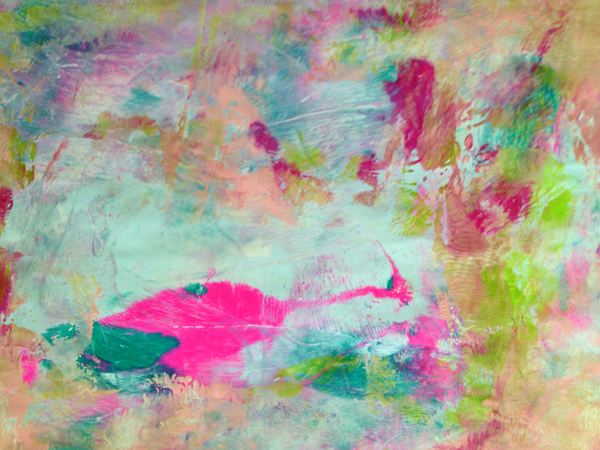
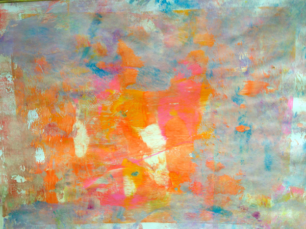
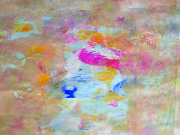
This little post is in response to the dozens of requests I have had about my favorite paint colors. I have so many - but these are the few I seem to go most often!

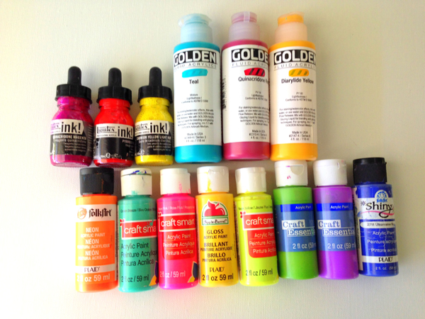
In order from top to bottom, left to right ------>

LIQUITEX INKS - pyrrole red. quinacridon magenta. cadium yellow light hue.

GOLDEN ACRYLIC PAINTS- teal. quinacridone red. diarylide yellow.

ASSORTED ACRYLIC CRAFT PAINTS - I like the glossy colors too!

FolkArt- neon orange. Craft Smart- ocean breeze. Craft Smart- neon pink. Apple Barrel (gloss)- dandelion yellow. Craft Smart- neon yellow. Craft Essentials- apple tart. Craft Essentials- neon purple. Plaid Shiny- ultramarine blue.

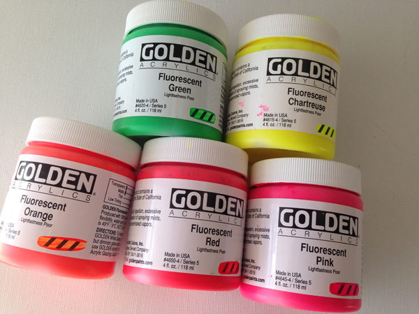
GOLDEN HEAVY BODY NEON ACRYLICS - Fluorescent Green, Fluorescent Chartreuse, Fluorescent Orange, Fluorescent Red, Fluorescent Pink.

I hope this helps. As I choose new favorites I will post them here to share with you! Happy Creating!

Friday
Sep062013

art stuff: gelli plate play

I like to use a colorful background as a starting point in most of my journal work and Gelli Plates are an awesome way to work with color and texture. For basic colored backgrounds just squeeze on a few different colored paints and roll them around with your brayer. Lay your page down and pick up the color. Repeat until most or all of the color has been picked up. It is cool to see what your next print will look like when it picks up some of the previous prints color.

Here are a few backgrounds I created this week.

Making these backgrounds is repetitive in nature and therefore soothing to me. I could do this all day. The bonus? I have pages at the ready when I go to work in my journal. Win win.


Wednesday
Aug142013

the process: sometimes mini canvas

...because lately I love anything new and tiny. (If you follow my instagram you will know why) --->

Tiny and Pretty. Enjoy the process!

Tuesday
Jun282011

Super Sweet Organizer - on the Cheap!


I am a lover of containers of any kind...and an even bigger fan of organization. I recently stumbled across this "file" box at a local outlet store. It was a pretty enough blue color, not exactly what I wanted, but since it was only $7.00 I grabbed it up anyway. I loved the staggered tiers for files, papers, notes. AND it had one drawer as well. A keeper.


...I found some paint in the garage....a shade of white...and I started painting. The first coat showed thick brush strokes, so after it dried I added a second coat that I applied with a soft cloth, rubbing it on in a smoother coat. Once the second coat dried, I used coarse sand paper and heavily distressed the edges and the drawer pull. Once I was happy with the level of distressing I took a finer sanding block and rubbed over the entire box to smooth things out. A final coat of minwax, in clear and it was finished. I LOVE IT.


Monday
Jun202011

Art Supplies Get a Pretty New Home


I love to create scrapbooks and mixed media journals and all sorts of artsy things, so my stash of supplies is, well, enormous. I have a slight sickness when it comes to organization and my things having a "home," so when the quantity of pretty glitter glues became overwhelming, a new container was needed for storing them. I use them alot, so I wanted them to be easily accessible, and of course, I wanted them to be in something "pretty!" ...in comes that wonderful man again...
A two by four and a drill and he was off to creating.
It was a little rough around the edges, but it was just what I wanted. It would fit perfectly on the art studio island!
I added some layers of paint and took the palm sander to it....then I hand sanded the edges of the holes where it was extra rough from the drill bit.....
 ...it looked so sweet loaded with those soft "sherbety" rainbow of colors!
 Did I mention he rocks?


Wednesday
Jun152011

White Wednesday -Shabby French Sign


      I had the good fortune this past weekend to both spend time with sweet, sweet friends AND go thrifting! We had a great time and I found many wonderful treasures (more photos to come later)...but one of my favorite finds was from a local Home Goods Store that we ventured into at the end of our outing! A sweet faux chalkboard. It was a cross between a salmon and red color....pretty, but not white. (I am sorry, in my haste I forgot to get a shot of the red color before beginning to paint). I wasn't sure what I wanted to paint, but I knew I wanted it to be a sign of some sort. I found a pretty french label on the Graphics Fairy and used some of the verbage on my own sign. I am NOT a detail painter by nature, so I had to give the whole thing a really good sanding at the end to disguise my less than perfect lettering. I love the end result. It looks worn and weathered, just like I had hoped. I will be sharing this inspiration on White Wednesday! Enjoy!


Monday
Jun132011

Vintage BreadBox


 When I found this really cool old breadbox many years ago I fell in love with it. It was metal and junky and perfect. I cleaned it all up and have used it forever now, in my kitchen...I finally decided it needed a new look. I didn't want to paint the entire box as I adore the old metal finish, so I just gave the gold "pane" on the front a mini overhaul. Cotton Knit paint and some cool lettering is all it took to make it look fresh and beautiful. Enjoy!


Thursday
Jun092011

in my house: farmhouse chic


This "too modern for me"sofa table got a soft, sweet makeover today. The table was dark and modern and very clean lined. I wanted soft and shabby... and since it lacked all the scrolly stuff I love, I gave it an extra rub down with the sander and got a sweet vintage farmhouse look!


Thanks to Gina's { The Shabby Chic Cottage } great tutorial I was able to get a gorgeous two-tone "years of layered paint" look! She rocks!


Sunday
Jun052011

Dreamy Dresser Redo

...another redo...this time a dresser. I loved it's original layout of seven drawers - three on top and four on the bottom...it was appealing to the eye ( I love things in odd numbers ). Suddenly something that was classic in appearance, turned dreamy! I loved the "cracked pepper" top against the "cotton knit" bottom. 
Sanding this piece was a must as it had a pretty glossy finish on it. A palm sander was necessary for this step as the piece was so big in size. Then a coat of primer, two coats of paint. Some minor sanding for this piece, nothing too distressed to take away from the classic look, and a wonderful coat of wax and final buffing.
The original hardware was so awesome that I was sure to use it again, once the piece was complete...and the drawers were already lined with this amazingly cool vintage paper that coordinated with the dresser colors perfectly. The before and after photos are amazing. Take a look at the wonderfully Dreamy Dresser Redo!
Linked to Frugal Friday - Check out all the other fabulous DIY ideas!


Saturday
Jun042011

Super Sweet Nightstand Makeover

...this awesome thrift store find is transformed into a beautiful shabby, vintage nightstand.
When my friend Sandi asked me to do this piece for her I was a little nervous. I never know just how much "distressing" some people will like...but the more I worked on it, the more it came into it's own. The scroll work on the drawer and the turned feet are just perfect. Two coats of "cotton knit" paint , a super lot of sanding, then more sanding on top of that...lastly, a thick coat of natural wax and a good buffing. Simply Sweet. I am linking this to Metamorphosis Monday, so check out this and other great inspiration here:

BEFORE AND AFTER PHOTOS SHOW THE SIMPLE BUT BEAUTIFUL TRANSFORMATION!